Homeroom
Improving connection and wellness for educators.
My Role: UX / UI Designer
Outcome: mobile app that creates community and provides resources tailored to educators.
Why Homeroom?
As an educator at the Hammer Museum, I was passionate about making arts education accessible to students by teaching art history lessons directly in the museum galleries.
When the Covid pandemic arose, I collaborated closely with classroom teachers who were grappling with the transition from in-person to online instruction. Instead of school groups coming to the museum, I now taught in their virtual classrooms on Zoom.
Through this experience, I witnessed firsthand the challenges educators face as they strive to balance the diverse needs of their students while navigating the intersection of their personal and professional lives. I wanted to develop a solution that could assist teachers in finding positive outlets for support.
The Problem
Teachers are unsupported and worn out.
Educators are the backbone of our society, but are often overlooked and under-appreciated. They typically have limited access to tools for mental wellness and lack peer assistance from other teachers.

The Solution
Community with other educators is vital.
Wellness resources for educators.

Promote educator connection.


Connection and personal wellness go together.


Process Overview

User Research
67 educators were surveyed and 10 were interviewed to better understand the current state of educators’ mental health, access to mental health resources, and identify any gaps in their support systems.


Affinity Diagram

Quotes from user interviews were synthesized into main themes using an affinity diagram. The amount of teachers who spoke about the impact a sense of community has on their well-being was surprising and astounding. It was also notable that lots of interviewees had physical and mental distress due to their jobs, but many did not have coping mechanisms for it.
Key Takeaways
These takeaways narrowed the focus to a mobile app that would allow educators to develop relationships with other educators and find curated mental health and educator-specific resources.


Competitor Analysis
There is a gap in the market. None of the competitors had a buddy system in place to create community and improve mental health, specifically for educators.

User Flow
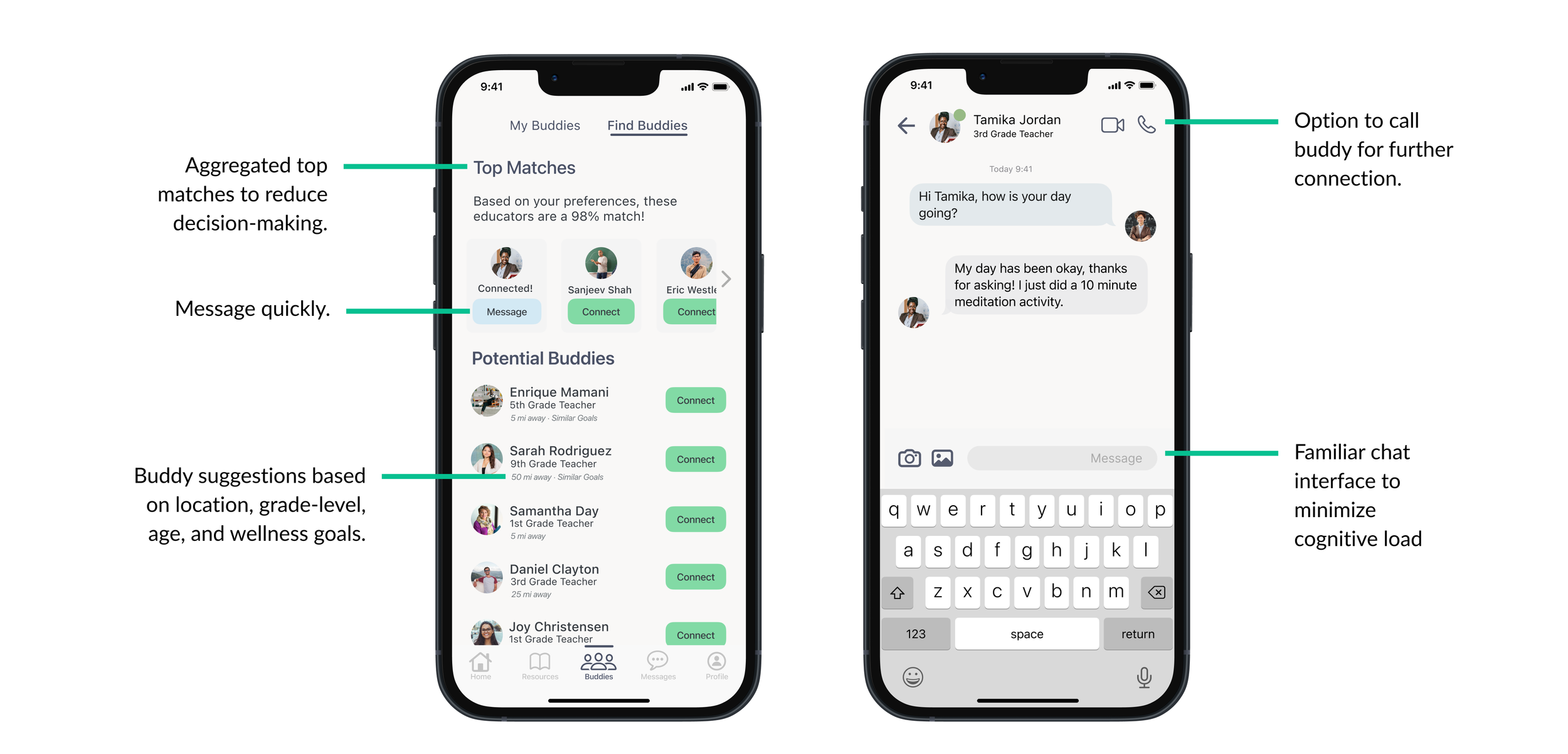
After determining educator connection was the main priority of the app, a user flow was created that focused on messaging and connecting a new buddy.

Concept Sketches
In the sketching and V1 prototyping phase, the main feature of buddy chatting was on the homepage, with secondary features such as resources and mood-tracking on less prioritized pages.


Wireframes: Round 1
Concept sketches were turned into low-fidelity, then mid-fidelity wireframes, maintaining a homepage that highlights buddy chatting.

Usability Testing
Usability Testing Goal
The objective of the usability testing was to discover the frustrations, pain points, and potential opportunities in the buddy connection, messaging process, and sharing of resources. The user experience should be set up in a way to best facilitate connection, support, and ease.
To gather this data, a series of virtual, moderated usability tests were conducted. This method ensured the visualization of the true user experience in real time in order to gather valuable feedback from participant answers, body language, and facial expressions.
Target Audience & Participants
The target audience consisted of educators in the United States who feel their profession has negatively impacted their mental health. They have reported feeling isolated and anxious, and are looking for ways to build a community of support.
Scenario
“Imagine you are a third-grade classroom teacher struggling with anxiety and loneliness, and you’ve been using Homeroom for around a month. You want to continue building your community, be able to log your mood, and check out teaching-specific resources to help you feel supported.”

Usability Testing: Round 1


Key Insights & Iterations


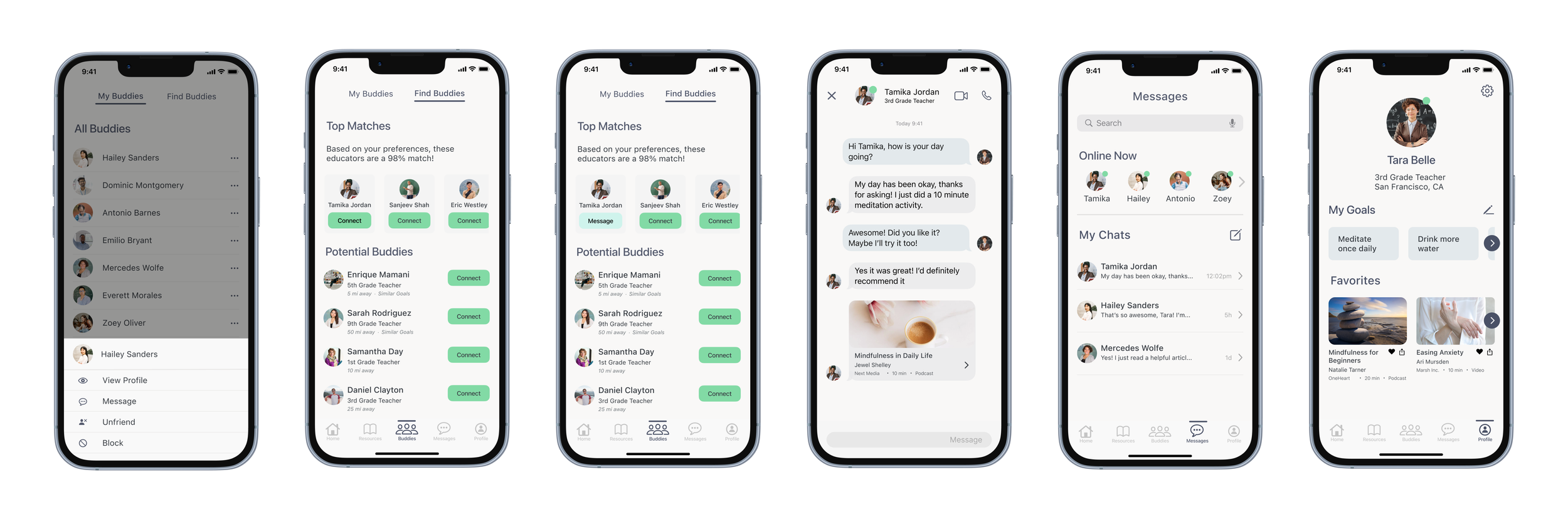
The first round of usability testing revealed that users wanted more interaction with resources rather than prioritizing the chat feature on the homepage. After iteration, resources were displayed on the homepage in two ways. The “Dailies” section allows the user easy access to a synopsis of recommended resources while the Buddy Feed allows buddy connection paired with resource engagement. Users also found the Mood Tracker design confusing. This design was iterated to improve the ease of use.
Usability Testing: Round 2
The second round of usability tests shed further light on issues with the iterated homepage. Users were confused why the Dailies were on the homepage, and wished that the Mood Tracker feature was more accessible. Users also felt the design was overwhelming, which lead to increased padding and a card redesign.
Key Insights & Iterations


Design System

Card Design


High-Fidelity Interfaces


Next Steps


What I learned
User Research is Key: Interviewing educators was crucial in uncovering their need for increased connection with peers. Finding this problem and understanding its urgency would’ve been impossible without firsthand insights. Thank you to all educators who generously contributed their time to this project!

Simplicity: Users prefer simplicity and minimalism in design, especially when the user demographic is managing a cognitive disability where becoming overstimulated should be avoided. A major learning point from usability testing was ensuring the app design had enough white space and padding to decrease cognitive load. These decisions are also adherent to inclusive, accessible design.

Crank Out Ideas: Having as many ideas as possible in the sketching and prototyping phase is extremely helpful in pin-pointing the most effective design outcome. In the future I hope to create more sketches and low-fidelity screens, leaving no design possibility unexplored.
