VietHope
Information architecture, UX Strategy, User Research, Content Design for VietHope website.
My Role: UX / UI Designer
Project Overview: Increase donations from working professionals in the Bay Area.
About VietHope
VietHope is a nonprofit organization that provides scholarships to disadvantaged students in Vietnam, helping them rise out of poverty and reach their full potential with access to education. The organization provides scholarships to high-achieving students from low-income families, with the goal of helping them attend college and achieve their educational goals. VietHope continues to work towards its goal of improving education and opportunity for those who need it most.
Problem Space & Project Goals
Through the initial stakeholder interview, it was discovered that VietHope currently has a small number of donors in the 50-60 age group who generously donate annually. To broaden their donor base, VietHope’s goal is to secure donations from a broader range of individuals, targeting working professionals aged 30-40, at a sub-$1,000 level per donation.


The Solution
Transparency is necessary for building trust in prospective donors.
Show statistics to build credibility and trust.


Donors know the exact impact of their donation.


Personalization and appreciation matter.


Process Overview


User Research
To gain insights into the factors that motivate individuals to engage with nonprofit organizations, a survey was conducted with 37 individuals who had previously donated to nonprofits. In addition, 10 people from VietHope's current donor demographic (ages 50-60) and 10 from the target age demographic (ages 30-40) were interviewed to further understand these drivers of engagement.


Usability Testing
The current VietHope website underwent usability testing with individuals who had prior experience with nonprofits. The users were requested to give feedback on their emotions and experiences while navigating the homepage and donation process.


Key Takeaways & Action Items
After synthesizing the information from the survey results, user interviews, and usability testing, it became clear that three main themes kept arising. Paramount in receiving increased involvement was transparent and digestible information. Users needed to feel a connection to the nonprofits and its mission before donating their money.


Prioritization Matrix
Synthesis from user data, stakeholder meeting and brainstormed features were added to a prioritization matrix in order to filter concepts and identify the key features that required emphasis and inclusion to ensure that the most important elements were addressed first.


Information Architecture
Developing site maps for the initial VietHope website aided in comprehending its structure and further building empathy towards its users. An essential element in the website redesign was the reorganizing of the information architecture to enhance the comprehensibility of the organization's overall structure.

Ideation
In the sketching and V1 prototyping phase, the main feature of buddy chatting was on the homepage, with secondary features such as resources and mood-tracking on less prioritized pages.

Mid-Fidelity & Usability Testing

Usability Testing Goal
Usability testing was conducted on individuals who met VietHope’s target donor persona. Users were asked to browse the homepage, and complete the donation flow. The objective was to identify usability issues and areas of improvement that could enhance user satisfaction, donation completion rate, and overall satisfaction of information on the homepage and the usability of the new donation flow. The results of the testing helped inform design decisions, prioritize improvements, and ultimately create a better donation experience.
During the high-fidelity phase, the issues identified through usability testing were resolved through iterations. The key findings of the usability testing revealed that the image on the donation page obstructed users' view of the content below, and that users sought more detailed information on how their donations would benefit the students.
Iterate to High-Fidelity
Stakeholder Feedback
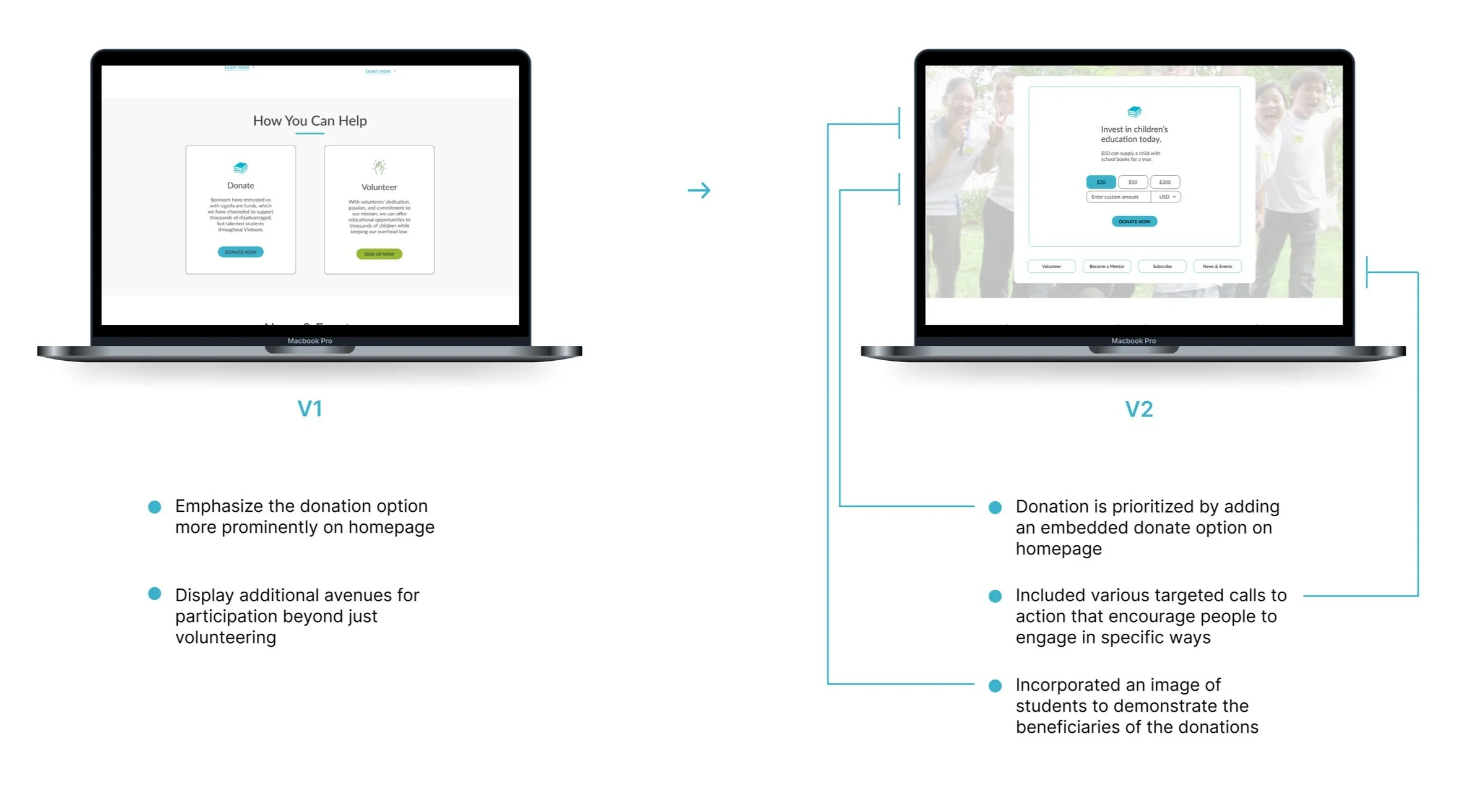
After presenting the high-fidelity designs of the homepage and donation process to the stakeholders, they communicated their desire to prioritize the donation capability over the "Volunteer" call-to-action under the "How You Can Help" section on the homepage. In response to their feedback, I incorporated an embedded donation section on the homepage, accompanied by smaller involvement CTAs beneath it.

Next Steps


Takeaways & What I Learned

Clear Communication is Key: One of the most important aspects of building user trust was ensuring VietHope’s messaging was clear and easy to understand. Users should be able to quickly and easily understand the nonprofit’s mission, what impact it has, and how donations will make a difference. Simple language, clear calls-to-action, and concise UX copy were emphasized to achieve this goal.

Security is Crucial: One of the biggest barriers to user trust when it comes to donations is security. Users need to know that their personal and financial information is safe when they donate to an organization. To address this issue, a thoughtful design that incorporated security badges was important.

Social Proof is Powerful: Demonstrating that VietHope is making a real impact was important for building credibility to potential donors.This was achieved in the VietHope design by providing success stories from scholarship students, information on donors and partnering universities, and testimonials from past volunteers. By providing social proof, users are more likely to trust the organization and be inspired to donate.